At rowsandall.com, I and a few other rowing data enthusiasts are building a platform for analyzing rowing (OTW & OTE) data. This all started back in May when Greg Smith (Quantified Rowing) developed a Python script to work with the Painsled iOS exported stroke data. I added a TCX parser and then quickly expanded the toolbox with a few other rowing data formats. The next stage was to develop a simple Python driven web site for users without Python knowledge. It took a few months to make something usable, but even though we’re still in beta mode, the current pages are pretty usable.
We’re currently supporting CrewNerd, Rowing in Motion, Ergdata, Ergstick, NK SpeedCoach, RowPro and Painsled. Also, you can import data from Strava, SportTracks and the Concept 2 logbook, so it should be easy to get your data in the tool. Also, we will be ready for Power data from the Empower Oarlock once it’s shipped.
The user interface of the pages is not the prettiest, but there are some YouTube videos to get you started.
On top of the basic plotting of your workout, we are starting to add some Meta Analysis features, where you can look at your accumulated data (all workouts in a certain date range, for example). We’re really just starting to explore the possibilities, so here are a few teaser plots. The data are my erg rows, between August and today. 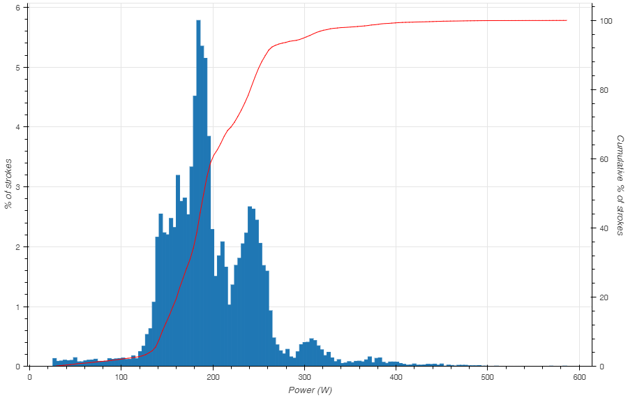
Here is the Power Histogram. It shows you the percentage of strokes at a given Power. So, for example, you can see that I have been doing most of my strokes just below 200W, which is my steady state power. Still, about 30% of my strokes are actually below 150W. Those are warming up and cooling down strokes, mainly. Then there is a second, wider peak around 245W, which is my “hard distance” or “threshold” power.
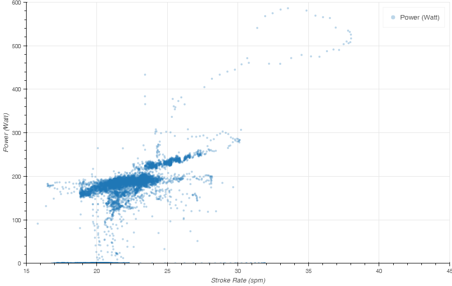
This next plot is simply the Power vs Stroke Rate. There is a funny loop up to 40SPM and 600W, which is from my “one minute full out” effort. What I find interesting to see is that there are two distinct groups of power/SPM data points. The group starting at 23SPM and higher is completely separate from the group between 18SPM and 24SPM. Would that suggest that I row a different stroke for Steady State vs Threshold rowing?
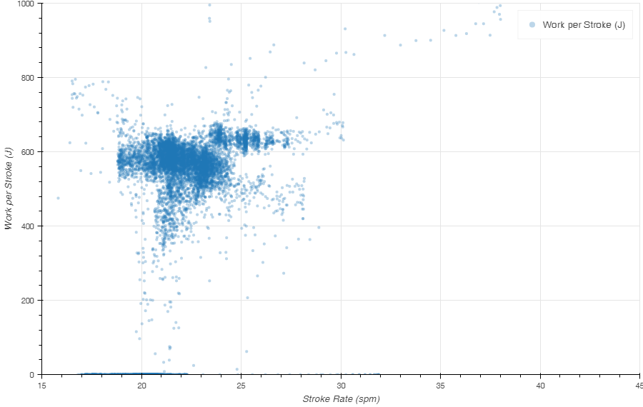
Here is a different look at the same data. Instead of Power, I plot the Work per Stroke (the infamous SPI which you basically get by dividing the power by the stroke rate). So it looks like in Steady State, I ease up on the strokes going to higher SPM, while in Threshold Rows, I keep the Work per Stroke around 600-625 Joule.
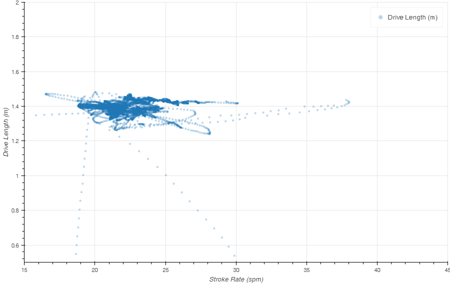
A quick look at the drive length to see if there is anything interesting here. The “data excursions” are probably start sequences. For the rest it seems I am pretty constant at 1.4m, but there is a significant amount of slightly longer strokes.
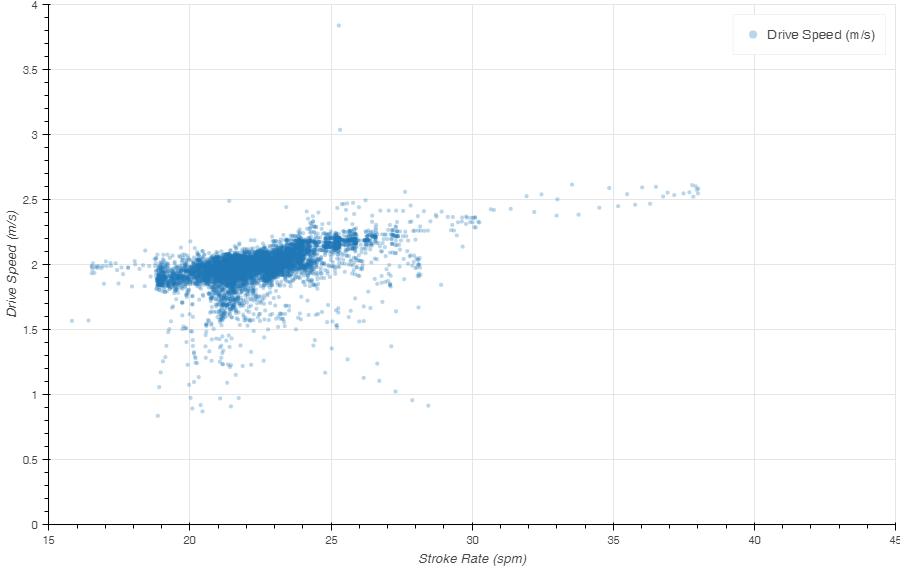
Finally, drive speed goes up with stroke rate. That seems logical. To keep the pressure on at higher flywheel speeds, you need to drive faster.
Currently, we are working on adding ways to slice the data in such a plot, and some other bells and whistles. If you’re interested, drop me a line in the comments, or just register for free at rowsandall.com, start uploading your erg data and play with them.
Follow me in social media
Like this:
Like Loading...
Oct 25 2016
Meta Analysis of Concept2 Erg Data
At rowsandall.com, I and a few other rowing data enthusiasts are building a platform for analyzing rowing (OTW & OTE) data. This all started back in May when Greg Smith (Quantified Rowing) developed a Python script to work with the Painsled iOS exported stroke data. I added a TCX parser and then quickly expanded the toolbox with a few other rowing data formats. The next stage was to develop a simple Python driven web site for users without Python knowledge. It took a few months to make something usable, but even though we’re still in beta mode, the current pages are pretty usable.
We’re currently supporting CrewNerd, Rowing in Motion, Ergdata, Ergstick, NK SpeedCoach, RowPro and Painsled. Also, you can import data from Strava, SportTracks and the Concept 2 logbook, so it should be easy to get your data in the tool. Also, we will be ready for Power data from the Empower Oarlock once it’s shipped.
The user interface of the pages is not the prettiest, but there are some YouTube videos to get you started.
On top of the basic plotting of your workout, we are starting to add some Meta Analysis features, where you can look at your accumulated data (all workouts in a certain date range, for example). We’re really just starting to explore the possibilities, so here are a few teaser plots. The data are my erg rows, between August and today.
Here is the Power Histogram. It shows you the percentage of strokes at a given Power. So, for example, you can see that I have been doing most of my strokes just below 200W, which is my steady state power. Still, about 30% of my strokes are actually below 150W. Those are warming up and cooling down strokes, mainly. Then there is a second, wider peak around 245W, which is my “hard distance” or “threshold” power.
This next plot is simply the Power vs Stroke Rate. There is a funny loop up to 40SPM and 600W, which is from my “one minute full out” effort. What I find interesting to see is that there are two distinct groups of power/SPM data points. The group starting at 23SPM and higher is completely separate from the group between 18SPM and 24SPM. Would that suggest that I row a different stroke for Steady State vs Threshold rowing?
Here is a different look at the same data. Instead of Power, I plot the Work per Stroke (the infamous SPI which you basically get by dividing the power by the stroke rate). So it looks like in Steady State, I ease up on the strokes going to higher SPM, while in Threshold Rows, I keep the Work per Stroke around 600-625 Joule.
A quick look at the drive length to see if there is anything interesting here. The “data excursions” are probably start sequences. For the rest it seems I am pretty constant at 1.4m, but there is a significant amount of slightly longer strokes.
Finally, drive speed goes up with stroke rate. That seems logical. To keep the pressure on at higher flywheel speeds, you need to drive faster.
Currently, we are working on adding ways to slice the data in such a plot, and some other bells and whistles. If you’re interested, drop me a line in the comments, or just register for free at rowsandall.com, start uploading your erg data and play with them.
Follow me in social mediaShare this:
Like this:
By sanderroosendaal • Uncategorized • 2 • Tags: analysis, concept2, erg, meta, rowing