Technique in the 4-
Wednesday. The day when the CVK Brno Masters group tries to gather at 6pm and row the eight. Today, there was hope until 4pm. Then, there was an email that one of us had to urgently go to Prague for work.
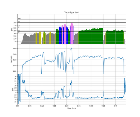
In the end there were six of us. And it was raining hard, so “Pazdy”, who is recovering from a back injury, didn’t want to row outdoors and chose the indoor rower. I announced that I want to row something else than the single, so in the end “President” took the single, and “The mouth”, “Turkey”, “Bulldog” and I rowed the coxless four. We did mostly steady state but we tried a few 15 stroke intervals at a higher rate/pace. The intervals were not so good, but after we did a few minutes of square blade rowing and alternating square blade/squaring we finally got a bit of boat run.
Revamped Stroke Analysis plot
Today, I revamped the Stroke Analysis plot. This chart is similar to the “flex chart”, the Swiss Army Knife of rowsandall.com’s charting capabilities. Just as with the flex chart, you can chose any metric for the X axis and two other metrics for the Y axis. The difference is that the Stroke Analysis plot doesn’t relate to a single workout, but instead it plots all strokes for a certain time period.
That functionality has been part of rowsandall.com for more 8 or 9 months, but I restricted it to erg workouts. Today, I have added a selector where you can chose the workout mode (water, rower, slides, skierg, snow, etc) and added OTW rowing related metrics.
To show what is possible, I have plotted all rowing strokes between March 1 and May 4 and created various Stroke Analysis plots. Because I use Empower Oarlock related metrics, the data are self-selecting for the single. If you row a lot in different boat types, you will see them all in this plot. In the future I will build a boat type selector so you can filter focus on one discipline.
I also filtered out all “paddle” strokes by selecting strokes at 500 J/stroke and higher.
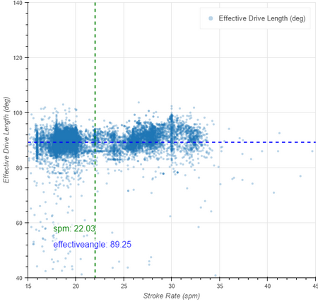
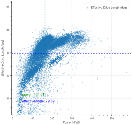
The effective length seems pretty consistent across the various stroke rates. If anything, I may have a slightly longer stroke at 30spm, and above that the length seems to decreate again. When looking at this metric in the boat, I like to see 90 degrees and higher.
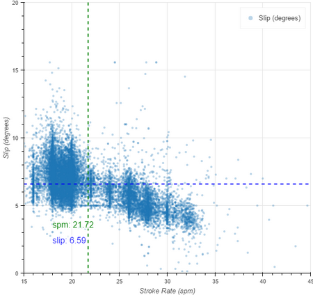
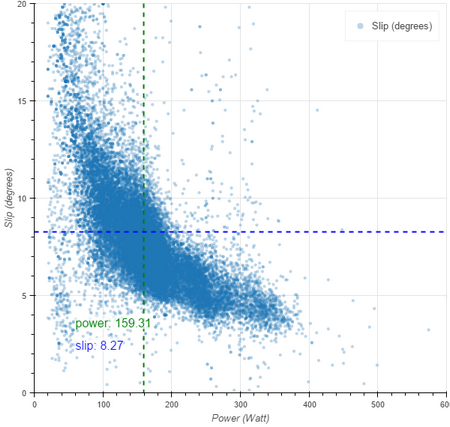
Slip, a measure for how quick I load up the blade at the catch. This metric is clearly lower at higher stroke rates.
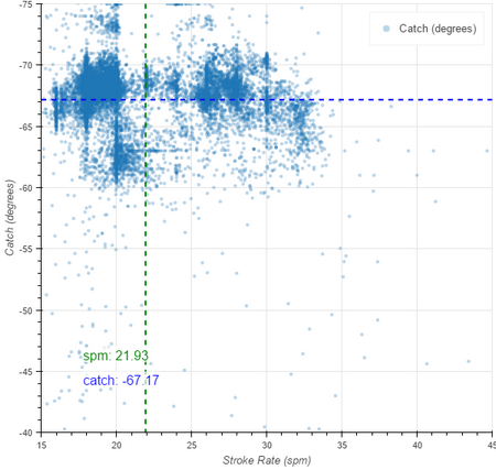
Catch angle vs stroke rate. I wonder what the group of strokes at the lower value is, but I suspect it is before I moved the footstretcher.
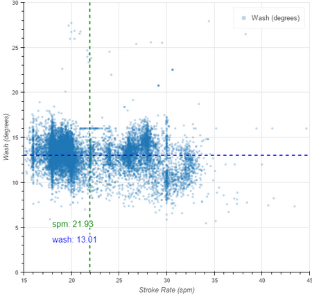
Wash, a measure for how long you keep the load on the blade before the tap down. Lower values are better. I have started working on this in the course of April. So if I select data from the second half of April to today, it should be better. Let’s check:

Hm. I guess there is work to do.
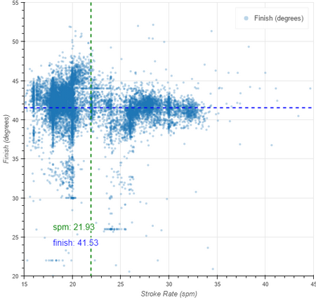
Finish angle. Again, there is a mix of footstretcher settings in this plot.
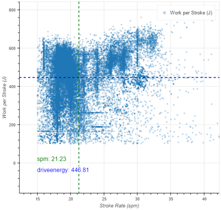
Work per stroke. Here I do include “paddle” strokes.
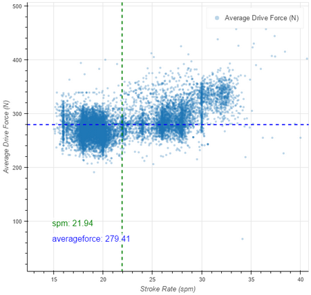
Average drive force. I seem to pull a little harder at the higher stroke rates.
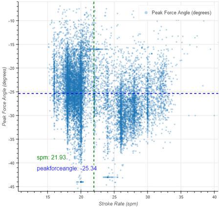
And finally – the peak force angle, i.e. the angle at which I reach the maximum force during the stroke. Most of the data are centered in a 10 degree wide range around 25 degrees (before the pin).
And here is, finally, a power vs pace plot:
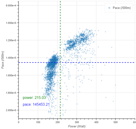
I have to adjust the units for pace. Currently, they are in milliseconds per 500m. Of course this plot is not normalized for head or tailwind, but still it is interesting.
How to use the Stroke Analysis
As with many things in data driven rowing, there is not a single answer to this. We are only starting to discover what is possible, and are exploring possibilities rather than focusing on what is useful. Still, I can imagine a few ways to use these data:
- Think of the graphs as a fingerprint of a certain rower.
- It will be interesting to see how the graphs vary between rowers.
- Perhaps they can be used to do a first selection of matching rowers for a double or quad.
- Look at time evolution of the graphs for a single rower.
Finally, above I have mostly put the stroke rate on the x axis. However, when you use Power instead, the graphs seem to start to make much more sense, even if you include “paddle” strokes. Just an observation.
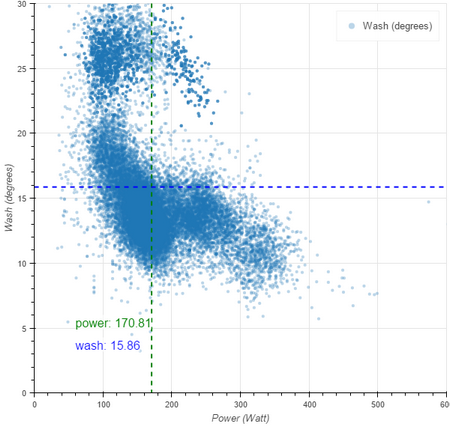
For Wash, I know quite well what the blob above 20 degrees is. These are steering strokes where I reduce the force on my starboard scull.
Looking forward to discussing and finding more use of these plots. Please explore and share your thoughts.
Follow me in social media
Like this:
Like Loading...
May 3 2017
Technique in the coxless four and the new Stroke Analysis plot
Technique in the 4-
Wednesday. The day when the CVK Brno Masters group tries to gather at 6pm and row the eight. Today, there was hope until 4pm. Then, there was an email that one of us had to urgently go to Prague for work.
In the end there were six of us. And it was raining hard, so “Pazdy”, who is recovering from a back injury, didn’t want to row outdoors and chose the indoor rower. I announced that I want to row something else than the single, so in the end “President” took the single, and “The mouth”, “Turkey”, “Bulldog” and I rowed the coxless four. We did mostly steady state but we tried a few 15 stroke intervals at a higher rate/pace. The intervals were not so good, but after we did a few minutes of square blade rowing and alternating square blade/squaring we finally got a bit of boat run.
Revamped Stroke Analysis plot
Today, I revamped the Stroke Analysis plot. This chart is similar to the “flex chart”, the Swiss Army Knife of rowsandall.com’s charting capabilities. Just as with the flex chart, you can chose any metric for the X axis and two other metrics for the Y axis. The difference is that the Stroke Analysis plot doesn’t relate to a single workout, but instead it plots all strokes for a certain time period.
That functionality has been part of rowsandall.com for more 8 or 9 months, but I restricted it to erg workouts. Today, I have added a selector where you can chose the workout mode (water, rower, slides, skierg, snow, etc) and added OTW rowing related metrics.
To show what is possible, I have plotted all rowing strokes between March 1 and May 4 and created various Stroke Analysis plots. Because I use Empower Oarlock related metrics, the data are self-selecting for the single. If you row a lot in different boat types, you will see them all in this plot. In the future I will build a boat type selector so you can filter focus on one discipline.
I also filtered out all “paddle” strokes by selecting strokes at 500 J/stroke and higher.
The effective length seems pretty consistent across the various stroke rates. If anything, I may have a slightly longer stroke at 30spm, and above that the length seems to decreate again. When looking at this metric in the boat, I like to see 90 degrees and higher.
Slip, a measure for how quick I load up the blade at the catch. This metric is clearly lower at higher stroke rates.
Catch angle vs stroke rate. I wonder what the group of strokes at the lower value is, but I suspect it is before I moved the footstretcher.
Wash, a measure for how long you keep the load on the blade before the tap down. Lower values are better. I have started working on this in the course of April. So if I select data from the second half of April to today, it should be better. Let’s check:
Hm. I guess there is work to do.
Finish angle. Again, there is a mix of footstretcher settings in this plot.
Work per stroke. Here I do include “paddle” strokes.
Average drive force. I seem to pull a little harder at the higher stroke rates.
And finally – the peak force angle, i.e. the angle at which I reach the maximum force during the stroke. Most of the data are centered in a 10 degree wide range around 25 degrees (before the pin).
And here is, finally, a power vs pace plot:
I have to adjust the units for pace. Currently, they are in milliseconds per 500m. Of course this plot is not normalized for head or tailwind, but still it is interesting.
How to use the Stroke Analysis
As with many things in data driven rowing, there is not a single answer to this. We are only starting to discover what is possible, and are exploring possibilities rather than focusing on what is useful. Still, I can imagine a few ways to use these data:
Finally, above I have mostly put the stroke rate on the x axis. However, when you use Power instead, the graphs seem to start to make much more sense, even if you include “paddle” strokes. Just an observation.
For Wash, I know quite well what the blob above 20 degrees is. These are steering strokes where I reduce the force on my starboard scull.
Looking forward to discussing and finding more use of these plots. Please explore and share your thoughts.
Follow me in social mediaShare this:
Like this:
By sanderroosendaal • Uncategorized • 0 • Tags: 4-, lake, OTW, rowing