Dec 20 2016
Dirty Dozen and One More
Another week where I allow myself one Anaerobic Power workout. Today, I repeated the 13×45″/1′ workout of last week. After that, I did something special to capture stroke power curves, but more about that in the next blog post.
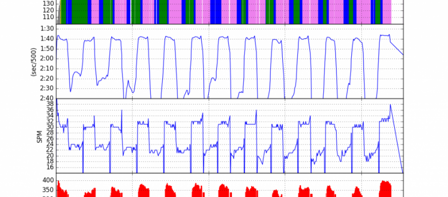
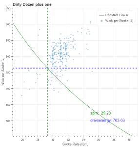
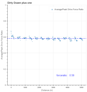
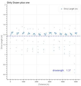
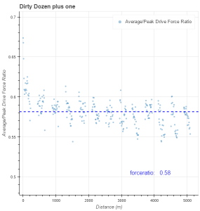
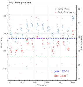
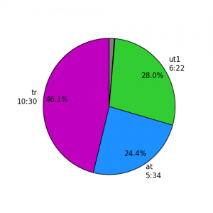
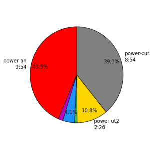
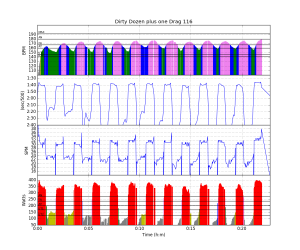
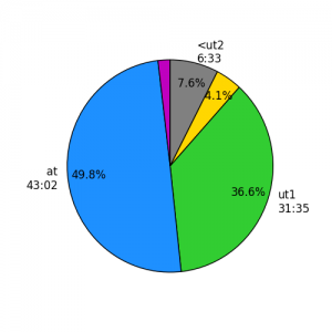
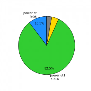
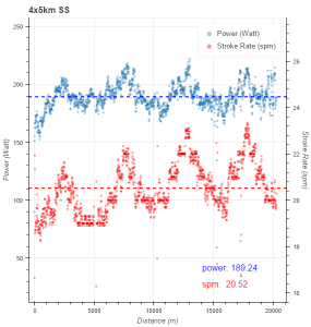
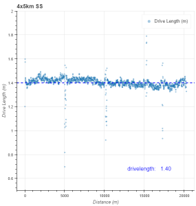
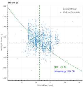
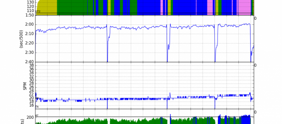
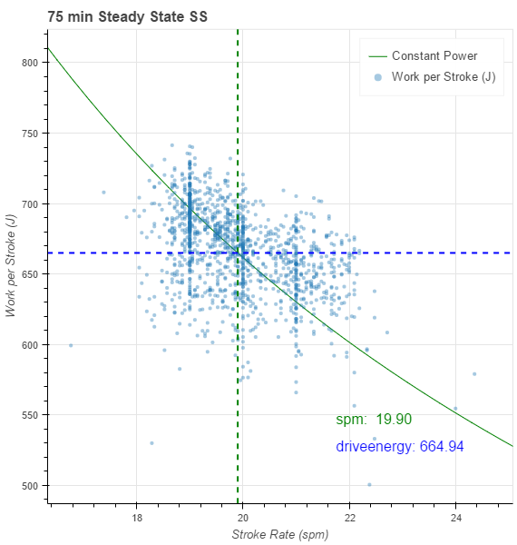
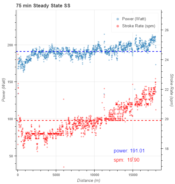
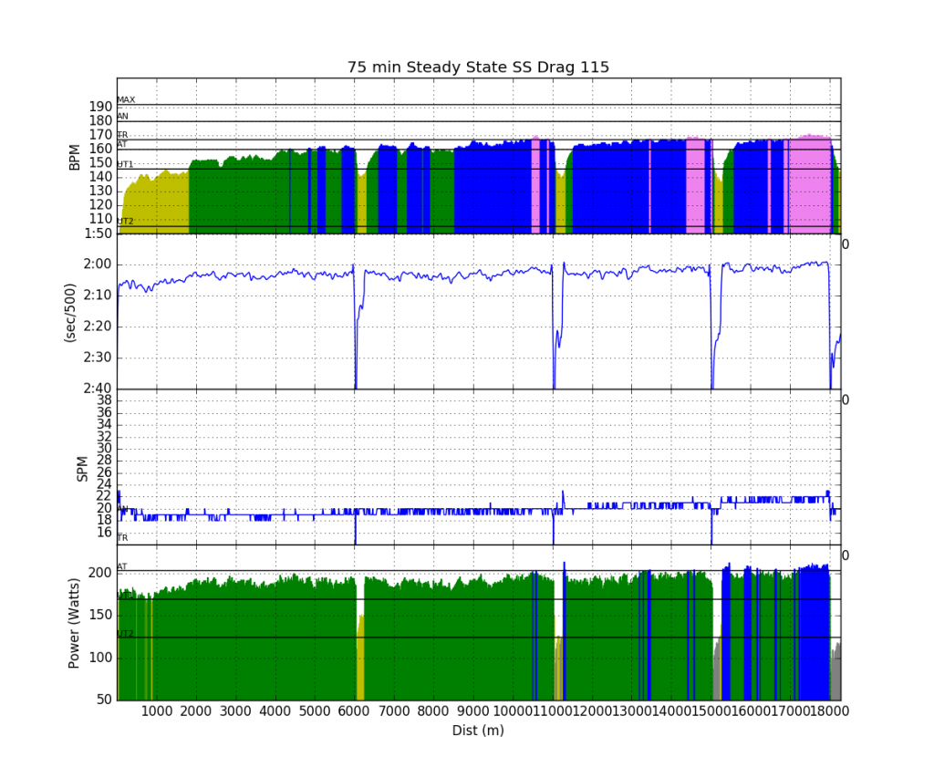
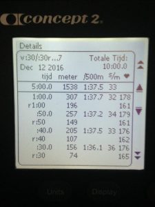
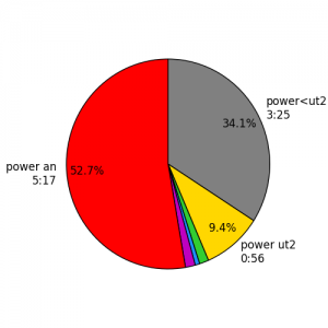
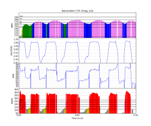
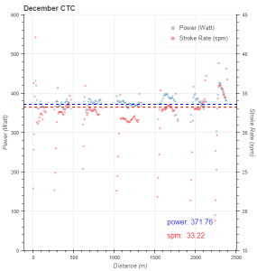
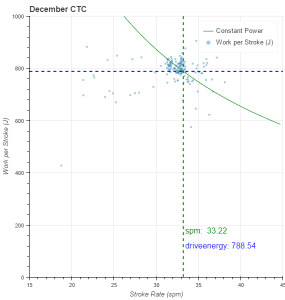
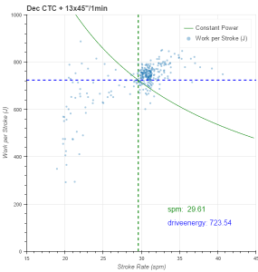
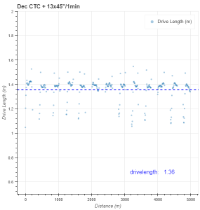
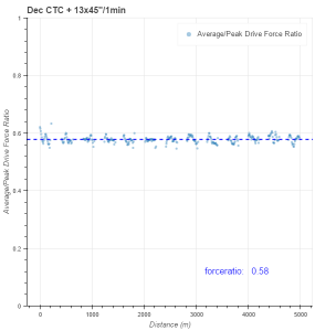
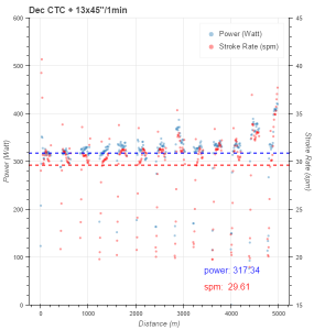
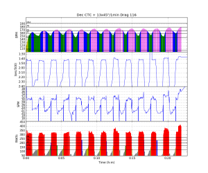
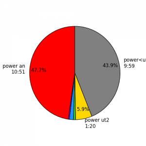
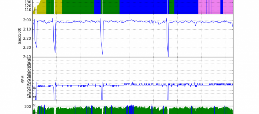
Here are the rowsandall.com plots for this workout. It was hard work. Somehow, I didn’t have the energy to go deep.
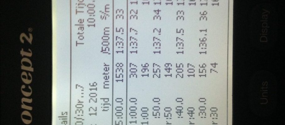
The workout editor has a little difficulty getting the averages right for these short intervals. On the PM5, I saw around 220-225 meter for the full 45 seconds, so I believe below statistics are underreported.
Workout Summary - media/20161220-1850090o.csv

--|Total|-Total-|--Avg--|-Avg-|Avg-|-Avg-|-Max-|-Avg

--|Dist-|-Time--|-Pace--|-Pwr-|SPM-|-HR--|-HR--|-DPS

--|05159|22:45.0|02:12.3|241.0|26.4|164.6|179.0|08.6

W-|02796|09:45.0|01:44.6|335.1|29.2|163.8|177.0|09.8

R-|02376|13:00.0|02:44.1|141.1|23.5|166.5|177.0|02.5

Workout Details

#-|SDist|-Split-|-SPace-|-Pwr-|SPM-|AvgHR|MaxHR|DPS-

01|00228|00:45.0|01:38.5|341.2|30.8|138.5|162.0|09.9

02|00215|00:45.0|01:44.9|333.4|28.7|161.6|170.0|10.0

03|00214|00:45.0|01:45.2|348.6|28.6|166.8|174.0|10.0

04|00218|00:45.0|01:43.0|348.8|29.6|164.3|174.0|09.8

05|00217|00:45.0|01:43.8|347.3|29.3|164.0|175.0|09.9

06|00216|00:45.0|01:44.3|336.7|29.8|165.0|175.0|09.7

07|00223|00:45.0|01:41.1|342.2|29.4|169.1|176.0|10.1

08|00220|00:45.0|01:42.2|322.2|28.9|167.1|175.0|10.2

09|00209|00:45.0|01:47.6|307.7|28.2|165.2|173.0|09.9

10|00216|00:45.0|01:44.2|339.3|29.3|167.0|175.0|09.8

11|00209|00:45.0|01:47.8|321.2|29.2|167.0|174.0|09.5

12|00207|00:45.0|01:48.6|316.9|28.2|166.6|174.0|09.8

13|00205|00:45.0|01:49.9|351.3|29.8|167.2|177.0|09.2
However, a week ago I had more than 200m less, so apparently I worked harder today!
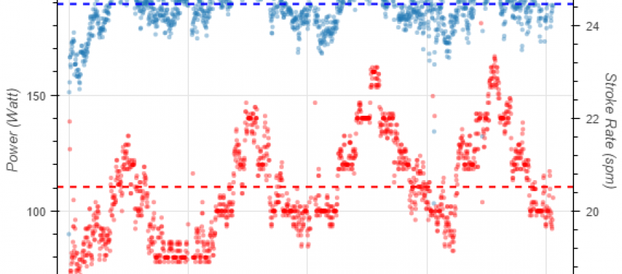
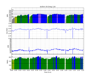
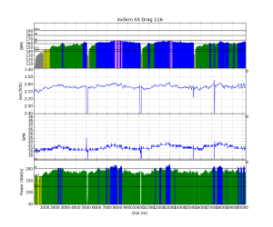
Click on the images to open the gallery. Also, according to the images, I did 15 Watt more.



Dec 20 2016
The mysteries of the force curve
For OTW rowing, I am not even convinced a force curve should be looked at independently from boat speed and acceleration. On the other hand, wouldn’t it be great if we could extract a few meaningful parameters from the force curve to help analyze technique?
The approach Nielsen-Kellerman have taken is using “Slip” and “Wash” parameters, which basically tell give you a reduction in effective stroke length. Slip is basically the stroke length (or oar angle difference) it takes to get to 100N of force from the catch, and Wash is the oar angle difference (or stroke length) near the finish at which the force drops below 100N. The figure shows this well (from the brand new “stroke profile” plot on rowsandall.com).
It turns out that the schematic stroke profile is pretty close to the real one. When I calculate the area under the curve and compare with the average stroke force, there is pretty good consistency.
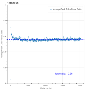
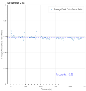
The ratio of average/peak force is a value between 0.5 and 1, the latter value just being a theoretical upper bound for a perfect block shaped force profile and the former the value for a triangular force profile. My values are pretty consistently around 0.57, but Greg Smith’s values are significantly higher (above 0.65 if I remember well).
So in the name of science, I did the following experiment on the erg. I must say using Painsled for iOS made it very easy to capture stroke profiles. I rowed a just row 150m off, 10 strokes “on”, varying stroke rate between 20 and 36spm. During the “on” strokes I tried to row what I consider good technique. Immediately after the 10th stroke, I grabbed the phone, did a screen capture, and took a picture of the PM5. I went up to 36spm, and back down, to see if there was consistency.
Before I show you all the raw data, here are the aggregate plots made on Rowsandall.com:
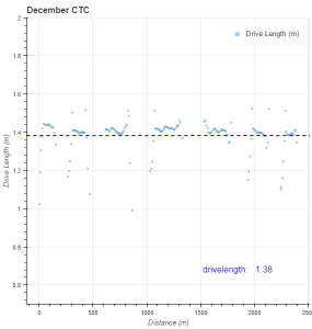
As you can see, my Average/Peak force ratio correlated positively with stroke rate, being 0.56 below 24spm, and 0.60 above 32spm. Drive length was pretty constant. I didn’t see a difference between going up the ladder or going down. Work per stroke correlated positively with the stroke rate, as did both average and peak force.
So here are the raw data, one set of stroke rates per picture gallery:
20 spm
24spm
28spm
32spm
36spm
The graphs from Painsled show the last stroke of the set of ten in bold, and a few of the strokes before in a lighter line. The pictures of the PM5 show the final stroke. I was struck by how different the pictures look from the graphs, but I guess that’s an effect of the vertical scaling.
I will have to think about this a bit more. Here is a link to the article by Kleshnev who has numbers between 0.5 and 0.6, with 85% of the rowers at the higher end.
I guess the next step will be to film my stroke.
At the least, I think this post is a good demonstration of the power of a good data analytics site, combined with the excellent erg data capture of Painsled.
Post Scriptum
Discussing the stroke profiles, Greg and I made the cumulative plots of the Average/Peak force ratio on rowsandall.com. Here are the two plots. Interesting to see the differences.
By sanderroosendaal • Uncategorized • 5 • Tags: concept2, erg, experiment, kleshnev, OTE, rowing, stroke rate, stroke ratio, technique